What is a Brand?
What is a brand? Is it a logo, a tagline, and a collection of colors, fonts, and visual guidelines? Is it an identity? World-renowned graphic designer and author Marty Neumeier disagrees with all of those definitions. He says it goes deeper.
"A Brand is a person's gut feeling about a product, service, or organization. It's a person's gut feeling, because brands are defined by individuals, not companies, markets, or publics. It's a gut feeling because people are emotional, intuitive beings."
Marty Neumeier, "A Brand Gap"

A brand is a feeling that comes up in someone when they interact with your product.
For example, it's no secret that the feeling when you unbox an Apple product has been carefully crafted by the company. The terms "sleek, clean, modern" have become synonymous with their brand.
What to Know Before Creating Your Brand
Who You're For
Ultimately, your brand is not what you say it is, it's what your customers say it is. Therefore, it is vitally important to understand your user base. Who are you trying to sell to? What do they need/want? How are their needs not being met? In fact, knowing who they are and how you're trying to serve them can clarify and define your brand. Most of the material and inspiration for my brand work came from user interviews that I did with people.
The best way I have found to get this information about who you're for is to interview the potential users in your market segments. Here is a full list of questions to get insights from your personas.
Besides interviews, do your own research! Just find ways to know as much as possible about your customers. A sneaky tactic I like to use is looking for existing interviews and meeting logs that the company has. More often than not, the company you are designing for already has tons of data on your customers. For example, when doing brand work for Lavalab, I looked through all of the responses from students applying to the club. I combed through the responses and looked for patterns in what applicants were looking for, and what got them excited about joining. For example:
“I would like nothing more than to surround myself with people from whom I can learn from and be inspired by.”
Drew, applying for PM
"I want to gain more technical experience and knowledge through working on new and innovative projects.”
Lara, applying for Development
“I want to join a club where I can actually apply my design ability to create tangible products”
Jane, applying for Design
These were hugely helpful in giving me further insights to work with for my brand. From this, I knew that people were looking for community, an opportunity to learn, and the experience of working on a tangible product. I knew I should convey those aspects through our branding.
Who You're Against
Who is in the same space as you? Who are you competing with for your customer's attention? How can you differentiate yourself from them?
Knowing your competitors can give you clarity into how you are different, and then focus your brand on what makes you unique.
There are many techniques for competitive analysis, but a quick and easy way to do this is through a competitive matrix.
Here is an example of a competitive matrix I did for Lavalab and how we were different from other similar clubs on campus.

Through this exercise, I realized that community was a much bigger aspect of Lavalab than I had previously thought. I gathered that the importance of community to the other aspects (such as being an incubator) was almost 50-50. Therefore, in my brand, I tried to emphasize community as much as possible, making it almost look like a "social" club.
Finding the Heart of Your Brand
Your company’s brand heart is a core document that outlines who you are, what you do, and why that matters. Every organization should have an idea of these questions, as a solid understanding of the shared vision brings employees together, helps the company make decisions in line with their values, and creates the future they want. Portraying this in your branding is important to attract the right customers and keep them coming back.
Here is a guide to finding your brand heart. The four parts that make up brand heart are:
- Purpose: Why do we exist?
- Vision: What future do we want to help create? What does the future look like?
- Mission: What are we here to do? How do we create that future?
- Values: What principles guide our behavior?
Here is the brand heart I created for Lavalab:
Purpose: Why the Company Exists
- Building a community, a tribe for the dreamers, the ones who believe they can change the world.
Mission: What your company does
- Facilitate Community: We maintain and facilitate a network of people at USC who are all in with the start-up space.
- Incubate: While we emphasize community, we also build and create stuff. Each semester we can hopefully send at least one team to further funding.
- Teach: Through fireside chats, workshops, lessons, and creating a product, we hope to educate students about what it takes to creating your startup or work in the tech industry
Values: How you do what you do
- Passionate: We don’t do this for the money or clout. Lavalab is for people who truly love the grind and believe in making the world a better place
- Energetic: We expect a lot from our members. Whether it be coming up with new ideas, sharpening their coding or design skills, or working around the clock to meet the deadline, we bring it every single time.
Of course, there are many more ways to develop and understand your brand. Above are just three of the things in my experience that help the most in giving you material to work with. If you have a good understanding of these, you are very well equipped to create an impactful visual brand that portrays your company.
Now, we will move into translating this knowledge into visual form. The essence of visual branding is how you represent the core feeling of your brand through colors, fonts, logos, and other visual elements. You will keep the findings and results of this first part in the back of your mind as you design.
Creating Your Visual Identity
Creating Your Name and Logo
I know that technically naming doesn't fall under the visual design company, but is extremely important if you are working on a new company. It can also be intimately tied with the logo.
Here is a framework by Ben Pieratt that I use for naming. Onym also has great resources to help you on your naming quest.
With logo design, there really are no rules about how to approach things. This is a time for you to push boundaries, explore new ideas, and try everything.
However, there are a few frameworks and methods that I have found elevate my work. Firstly, some best practices are:
- Make sure your logo tells a story: when you come up with a logo iteration, make sure you can explain what it represents or is trying to show. It's hard for design to be bad if you can give an honest rationale and explanation of your design choices.
- Imagine your logo in many different situations: adding color to your logo is great, but make sure that logo will still look good when placed on a black background, white background, and any other relevant colors. Sometimes, to simplify things, it is better to design your logo using only black and white first, before adding color.
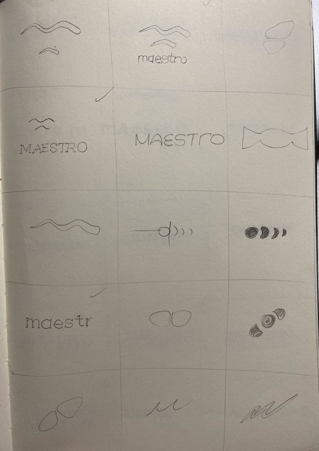
The first exercise I like to do when designing logos is thumbnail sketches. I split the page into 12 little boxes, and do quick & dirty iterations in each one. The goal of this exercise is not to make polished final logos, but to explore as many ideas as possible. Do as many iterations as you feel you need to, I usually do around 20-30, before showing the first round to your stakeholders/team-members. Ask them to pick top three they like the best, and then iterate on those.
Below is an example of thumbnail sketches I did for a fictional company named Maestro. Maestro uses AR glasses technology to act as a personal sports trainer.

LOGO THUMBNAIL SKETCHES I DID FOR MAESTRO
Once you have narrowed in on an iteration you like, sketch out a higher fidelity version of it on paper. It is now time to put it into Illustrator. Here is a video tutorial of how to put the photo of your sketch into illustrator and draw over it.
A method I use to make pixel perfect logos is the golden ratio technique, using the circles of that vary in size by the Fibonacci sequence. Here is a tutorial article. You can see how I used this technique for drawing out my logo for Maestro.


FINAL LOGO
Using a Style Tile
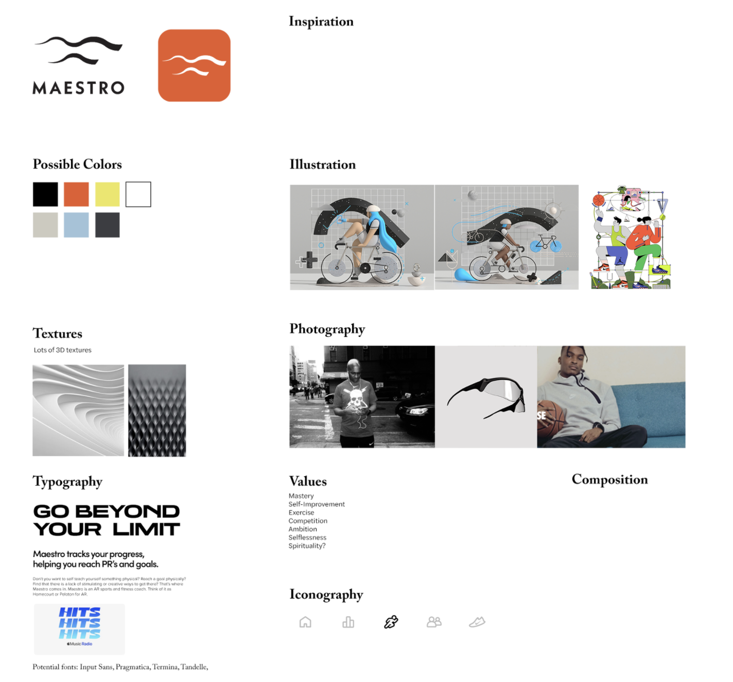
The style tile is a design deliverable that I use to define the rest of my brand. Elements like color, typography, patterns, illustrations, iconography, and other motifs. Some examples of style tiles are here.
My (unfinished) style tile for Maestro is shown below:

I will go over the most important elements of this style tile in the order that I usually tackle them on a project.
Values
The very first thing I do is think about the values I am trying to portray through my brand. If you did the research and preparation in part 1 of this article, you should have a pretty good idea of what those might be. Here is a list of values. List out about 5-10 of these on your style tile as a constant reminder of who you are.
Inspiration
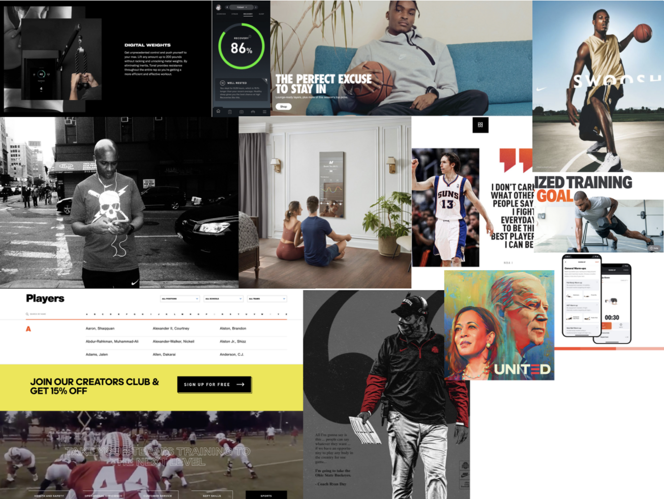
I usually create an inspiration board for how I want my brand to feel. This is a very intuitive exercise. There are no rules for this (except perhaps straight up ripping another company off). Think of it like creating your own Pinterest board for your brand.

MY MOODBOARD FOR MAESTRO, THIS ACTED AS THE INSPIRATION PART OF MY STYLE TILE
Colors
A great practice I like to do for colors is to color-grab from my moodboard. What do I mean by this? I take the exact colors and shades on my moodboard that I really like, and make those my brand colors. Yup, it's that simple. Here is an example of a preliminary color palette I made for Maestro. These colors can all be found in the moodboard above.

COLORS FROM THE MOODBOARD THAT BECAME MAESTRO'S BRAND COLORS
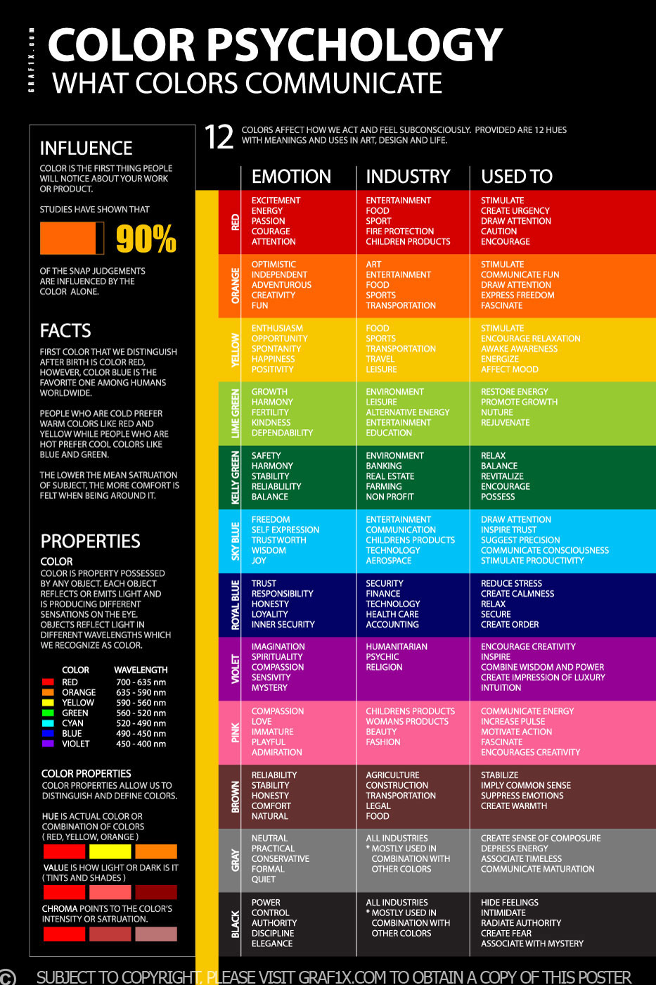
Another great practice in determining your brand's core color is color psychology. Of course, colors mean different things to different people, but you can never go wrong with this approach. Think about branding your company with the colors associated with the feeling you most want to convey.

PSYCHOLOGY OF COLORS
Typography
Choose fonts that, like everything else, contribute to conveying the emotion of your brand. I normally start with two fonts: one for headings and one for body text. Here is a simple article with some pro-tips for choosing fonts for your brand. This article talks about the psychology of fonts and the emotions different types of fonts can evoke in people.
Conclusion
The above is not an exhaustive guide to branding (I highly recommend ColumnFive's course for that). Rather these are just a list of methods and practices that have found me success in the past. My advice with art & design is to not hold rules too tightly. As a little-known Spanish painter named Pablo Picasso said:
"Learn the rules like a pro, so you can break them like an artist"
Your designs won't be perfect first go, but getting feedback, iterating, and having a teachable mindset will take you the furthest. And most importantly, have fun with it. Your work will shine the brightest when you've put passion and heart into it. If you put an honest effort into learning what you can, putting in focused work, and are able to explain your design choices, you can rest easy.
If you want to talk more with me, get advice, feedback on your work, or even just chat, please don't hesitate to reach out. The best way to reach me is LinkedIn or my email: snelder@usc.edu
Happy designing!
